
About TRAM
TRAM is a digital platform that rewards those who decide to take action to reduce their carbon emissions. TRAM helps individuals and corporate organizations to turn everyday positive actions into valuable and scalable global change.
TRAM users continuously earn digital TRAM tokens by measuring, monitoring, and reducing their carbon footprint by choosing sustainable modes of transport. Tram tokens can then be exchanged for rewards and incentives.
The app’s identity as a whole feels very futuristic and dystopian. While the futuristic theme could fit with the organization’s mission, the general outlook should be positive because the main concept revolves around making positive change towards a better future. The visuals shoud convey a utopian and optimistic theme.
The use of glassmorphism in the user interface is a signficant oversight, in my opinion. This style does not survive the layering of interface elements as seen with the navigation tab at the bottom of the screens. Combined with the insufficient contrast of the text, this style of UI elements is not very accessible.
The app does not do a very good job of showing the real impact of using it. Primarily, there is a lack of information about what a carbon footprint really is and how reducing it will benefit society. Additionally, users are not made aware of the impact of their actions, aexcept being shown the Tram Sustainability Rating which by itself, does not really mean much.
There is a lack of personality and emotional design in the app. Despite having a strong and noble mission, the app does not appeal to users’ conscience and emotions. The design language is cold, clinical, and devoid of warmth. It makes the user feel isolated and not really a part of community, even though the app does make a feeble attempt at building one.
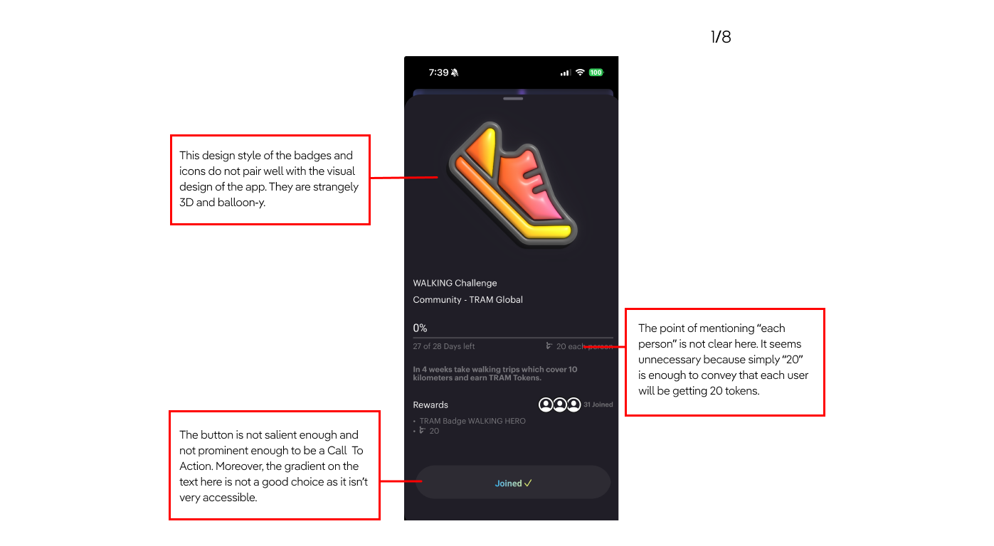
Current UI Critique


Screen-by-Screen Critique
Everything Wrong with the Color Palette
The color palette for the app is all over the place. Not only is the there a serious lack of cohesiveness, there is no definite color palette at all. The color combination of yellow and black of the icon is jarring. This color combination is not repeated anywhere else on the screens. Every screen is a different color and no intentnional design choices have been made in order to tie in elements together.


Based on the Plutchik’s Wheel of Emotions diagram, the color scheme that I have come up with evoke the emotions of anticipation, joy, and trust from the users. The combination of these emtotions will result in the user feeling optimistic about the future.
Tram is a platform that enables ordinary citizens to quantify their impact on the planet. It reminds users that climate change is a ticking time bomb and every small bit of change helps. For such a positive mission, the aesthetics of the app are surprisingly dull.
Therefore, when redesigning the application, I decided to take the visual design in a different direction, one that is positive and more optimistic about a changed future. One that is encouraging and clean, just like earth would be with reduced carbon footprints.
With the colors and other UI elements that I redesigned, I hope the new interface will trigger a desire for control, fun, and self-achievement.
Emotional Response Evoked By New Design

Moodboard

Personas

Sketches

Style Guide


Final Screens
